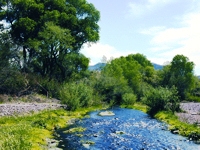
These data outputs are using the IBA polygons enabled in GIS to aggregate all data submitted from within the polygon — this differs from eBird hotspot summaries on those same pages, which draw on data from a single point that is shared among users. This means that these polygon-based queries are much more comprehensive and solve the problem of having a birder visit Sabal Palm Sanctuary and plot their own personal point for the property that never becomes part of the data output for the official eBird hotspot. Now you can view the IBa summary instead! These IBA summaries work much in the same way that eBird summarizes data for states and counties.
The types of output are all accessible from eBird’s “View and Explore Data” page: http://ebird.org/ebird/eBirdReports?cmd=Start. The main types of output are:
- Bar chart — Year-round summary of species frequency. Great for seeing patterns of occurrence within the year (i.e., migration).
- Line graphs — Clicking on any species name from the bar chart takes you to graphs of frequency, high count, abundance, birds/hour, totals, average count.
- Maps — Clicking on the map link from bar chart or line graphs takes you to a point map for the species zoomed in on the IBA; IBA boundaries are not shown.
- High counts — Shows highest reported count from inside IBA.
- Arrival/Departure date — Shows earliest/latest report in the year for a species.
- All-time First/Last — Shows first ever (i.e., the report from the longest ago) for any species in the area.
We encourage you to play around with these new output tools, and to promote them on your state IBA pages, via your listservs, and elsewhere. Just copy the link into text and it will link directly to these outputs. We really hope these data outputs will be useful for IBA assessments and for ongoing monitoring, which ideally will be done via eBird so that the data are instantly incorporated in these summaries.
eBird data grows every day, so if there are data gaps for your IBAs, please encourage people to collect data to fill the gaps, or pull your old notebooks out and enter historic data that will help fill the gaps. Below are some examples of IBA output.
BAR CHART — Arizona–Sonoita Creek Patagonia TNC Reserve IBA
LINE GRAPHS — Arizona–Sonoita Creek Patagonia TNC Reserve IBA — Lucy’s Warbler. Be sure to try changing the species and clicking on the different tabs.
HIGH COUNTS — New Jersey–Edwin B. Forsythe NWR–Brigantine Unit IBA
ARRIVALS — Nebraska–Rainwater Basin IBA
Each time you enter a checklist into eBird, your data are informing IBA managers and other conservation proponents in North America. Eventually we hope to enable data output like this for all of the world’s IBAs.
Note from Arizona IBA: when you bird in an IBA in Arizona, if you list ArizonaIBA as an observer on your survey and share the checklist, your data will come directly to the Arizona IBA program. See the July-September 2012 issue of the Vermillion Flycatcher for more details!


